- February 5, 2026
The Colors of Holi on a Plate: How to Style Festive Food Without Overdoing It
When Color Is Emotion, Not Decoration
Holi food styling requires balancing bold festive colors with thoughtful composition so the plate feels vibrant without overwhelming the eye. Holi is inseparable from color. It represents joy, playfulness, and celebration, filling spaces with energy and movement. But when it comes to food styling, color requires sensitivity and restraint. Festive food doesn’t need to shout or overwhelm the senses to feel celebratory. In fact, too much color can distract from what truly matters — the food itself.
As a food stylist, I’ve learned that the most inviting festive plates are often the quiet ones. The ones where color feels natural, familiar, and thoughtfully placed rather than forced into the frame. When color is used with intention, it supports the emotion of the festival without competing with appetite. It allows the viewer to feel the joy of Holi while still wanting to take a bite. Color should carry emotion, not dominate the plate. It should enhance warmth, signal celebration, and guide the eye gently, without overwhelming the dish. When handled this way, color becomes a subtle storyteller — one that celebrates the spirit of Holi while keeping the food appetizing, balanced, and true to its roots.
Let the Food’s Natural Palette Lead
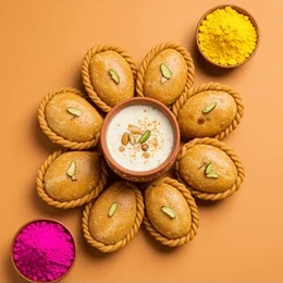
Holi food already comes with its own beautiful colors — the golden tones of fried sweets, the creamy whites of malai and thandai, and the warm browns of nuts, khoya, and jaggery. These shades are deeply familiar and instantly comforting, shaped by tradition rather than trends. When I begin styling, I always start here, letting the food’s natural palette guide every decision that follows.
These colors ground the visuals in authenticity and memory. They evoke home kitchens, festive mornings, and recipes passed down over time. When natural food colors are allowed to lead, the plate feels celebratory without trying too hard — festive, warm, and inviting, without ever feeling artificial or overstated.
Festive Accents, Not Festive Overload
It’s tempting to add bright elements everywhere during Holi, but restraint matters just as much as celebration. When too many colors appear at once, the eye doesn’t know where to rest, and the food can lose its sense of warmth and edibility. Instead of filling the frame, I prefer to introduce color in small, considered ways.
A hint of color in the background, a softly chosen prop, or a subtle garnish can communicate festivity without competing with the dish itself. Festive accents work best when they frame the food and support its presence, rather than fighting for attention. When color is edited thoughtfully, the food remains the hero — appetizing, balanced, and inviting.
Balance Keeps Food Appetizing
Appetite responds to balance. When colors are evenly distributed and thoughtfully placed, the food feels calm, inviting, and approachable. Balance gives structure to the visual story, helping the eye move naturally across the plate without confusion or fatigue. This sense of order quietly builds trust and allows the viewer to connect with the food.
Over-saturated plates may feel exciting at first glance, but that excitement fades quickly. Too much color can overpower texture and warmth, making food feel more graphic than edible. A balanced plate gives the eye room to pause and settle — and when the eye feels comfortable and unhurried, appetite follows with ease.
Texture Softens Strong Color
Texture plays an important role when working with festive color. Elements like powdered sugar settling naturally, crushed nuts scattered loosely, frothy thandai, or a lightly cracked sweet soften bright visuals and bring depth to the frame. These details break up strong color and keep the food from feeling flat, graphic, or overly styled.
Texture adds a tactile quality that makes food feel real and approachable. It reminds the viewer that the dish is handmade, freshly prepared, and meant to be enjoyed in the moment — not just looked at. When texture is allowed to show, color feels warmer, and appetite stays engaged.
Styling for Joy, Not Perfection
Holi is joyful, playful, and deeply social, and food styling should reflect that same energy without tipping into chaos. Festive food doesn’t need rigid structure or perfect alignment to feel special. In fact, a little looseness often brings more life to the plate. Slightly imperfect arrangements, relaxed compositions, and a gentle sense of movement help festive food feel natural and alive rather than carefully staged.
When styling allows for this ease, the visuals begin to mirror the spirit of the celebration itself — spontaneous, warm, and shared. Joy shows best when styling feels effortless, when it looks like the food belongs to the moment instead of being arranged for the camera alone.
Holding Back Is Part of the Craft
Knowing when to stop is just as important as knowing what to add. For me, styling Holi food is as much about editing as it is about creating — choosing elements that truly contribute to the story and quietly removing anything that feels unnecessary or distracting. This process of restraint keeps the focus where it belongs: on the food and the emotion it carries.
When excess is edited out, the visuals feel clearer and more intentional. The food is allowed to speak for itself, preserving its warmth and emotional connection to the festival. Festive doesn’t mean excessive — it means thoughtful, balanced, and true to the spirit of the celebration.
Final Thought
The colors of Holi on a plate should feel joyful, familiar, and warm — never overwhelming. When color is used with intention and restraint, festive food remains appetizing, balanced, and emotionally true to the celebration it represents. It allows the viewer to feel the joy of the festival without losing the comfort and familiarity that make the food inviting.
Because the most beautiful Holi plates don’t try too hard or demand attention. They simply feel right — grounded in tradition, guided by emotion, and styled with a quiet confidence that lets the food speak for itself.