- December 24, 2025
Common Food Styling Mistakes Brands Make (And How I Fix Them)
Great food deserves great presentation. Yet, many brands unknowingly make small styling mistakes that weaken their visuals, reduce appetite appeal, and prevent a genuine emotional connection with the audience. These issues are often subtle, but they can dramatically impact how a dish is perceived — whether it looks crave-worthy or easily forgettable.
Food styling isn’t just about placing food on a plate or making it look neat for the camera. It’s about storytelling, psychology, and visual balance — understanding how people emotionally respond to what they see. Over the years, working across different food categories and campaigns, I’ve seen certain mistakes appear again and again, regardless of brand size or budget.
The good news? Every one of these mistakes is completely fixable with the right approach, a trained eye, and an understanding of how food behaves on camera.
Here are the most common food styling mistakes brands make — and exactly how I fix them.
Mistake 1: Over-Styling the Food
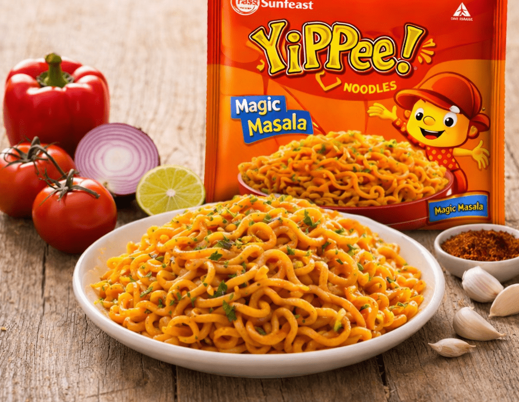
One of the biggest mistakes brands make is trying to make food look too perfect. Excess garnishes, heavy props, and overly polished plating often strip food of its natural charm. When everything is styled to the extreme, the food starts looking artificial — more like a display piece than something you’d actually want to eat.
How I Fix It
I simplify the frame. I remove unnecessary garnishes, reduce visual clutter, and allow the food to breathe. Real food looks most appetizing when it feels touched, served, and lived-in — not manufactured. Slight imperfections, uneven spreads, or casual placements often make food feel warmer and more inviting than forced perfection.
Mistake 2: Ignoring Texture
Food that looks flat rarely excites the viewer. When texture is ignored, dishes lose depth, dimension, and appetite appeal. Smooth, flat surfaces without contrast make food look dull and lifeless on camera.
How I Fix It
I bring texture forward intentionally. Crisp edges, soft folds, visible layers, gentle drips, crumbs, shine, and contrast between surfaces are highlighted. Texture is what makes food feel edible through the screen. Lighting angles, shadows, and camera positioning play a crucial role in making texture come alive.
Mistake 3: Poor Color Balance
Too many bright colors placed together can overwhelm the frame, while dull or muddy tones can make food look unappetizing. Without balance, even good food can look chaotic or lifeless.
How I Fix It
I create a clear and intentional color flow. Contrasting tones are balanced thoughtfully, neutral shades are used as visual breaks, and the food’s natural colors are enhanced — never forced. Color harmony ensures the frame feels cohesive, pleasing, and professionally styled.
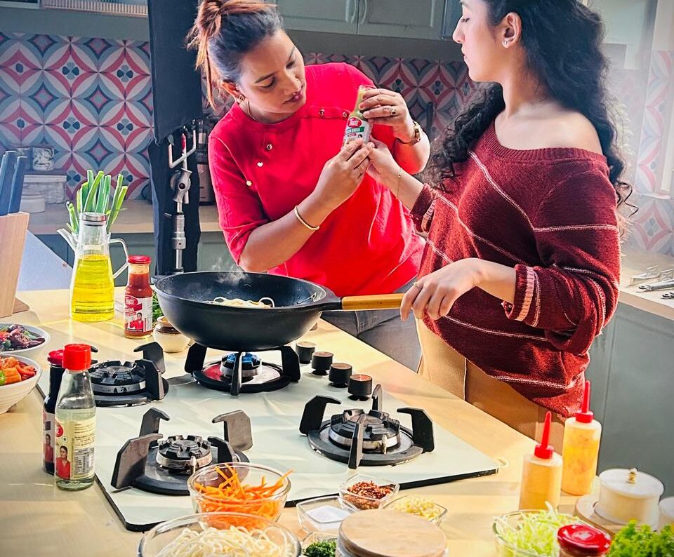
Mistake 4: Wrong Prop Choices
Using props that don’t align with the brand story or food category can confuse the viewer and weaken the message. Trendy props or random elements often distract attention away from the food.
How I Fix It
Every prop must earn its place. I carefully choose plates, fabrics, surfaces, and backgrounds that support the food’s story. Props should enhance mood and context, not compete with the dish. If a prop doesn’t add value or clarity, it doesn’t belong in the frame.
Mistake 5: Food Looks Cold or Lifeless
Cold food instantly kills appetite appeal. Steam disappears, gloss fades, sauces absorb, and textures dry out quickly — especially under studio lights.
How I Fix It
Timing is everything. I plan food rotations, keep backup portions ready, refresh gloss naturally, revive steam, and replace elements when required. The goal is to ensure the food always looks fresh, warm, and ready to eat, even after long shoot hours.
Mistake 6: No Emotional Storytelling
Many brands focus only on how food looks, not how it feels. Without emotion, visuals fail to connect with the viewer and become forgettable.
How I Fix It
I style with emotion in mind. A hand entering the frame, a spoon mid-serve, a slight spill, a torn piece of bread, or an open box instantly transforms a static setup into a moment. Food should feel experienced, not displayed — this is what creates emotional connection.
Mistake 7: One-Style-Fits-All Approach
Applying the same styling approach to every dish ignores the individuality of different food categories. What works for one dish may completely fail for another.
How I Fix It
I adapt the styling to the food. A burger needs indulgence and height. A thali needs abundance and variety. A dessert needs temptation and softness. A cafe plate needs ease and lifestyle appeal. Every dish has its own visual language — and I style accordingly to respect that identity.
Mistake 8: Not Considering Where the Image Will Be Used
A photo styled only for aesthetics may not perform well across different platforms. An image that works for packaging may fail on social media or digital ads.
How I Fix It
I style with the end platform in mind. Cropping space, orientation, negative space, composition, and framing are planned so the visuals work seamlessly across websites, social media, menus, packaging, and campaigns. This ensures consistency and better performance across all brand touchpoints.
Final Thoughts
Most food styling mistakes don’t come from bad intent — they come from a lack of understanding of how food behaves on camera and how people emotionally respond to what they see. Once these issues are identified and corrected, food visuals become instantly more powerful, more appetizing, and far more emotionally engaging.
Good food deserves more than just a good photo.
It deserves a story.
And when food styling is done right, the viewer doesn’t just see the dish — they feel drawn to it, imagine the taste, and want to experience it for themselves.