- November 7, 2025
Capturing Crunch & Fun: Behind the Scenes of My Lays India Shoot
A vibrant journey of styling, colors, energy, and snack-time joy.
Some shoots are emotional, some are luxurious — and then there are shoots that feel like an explosion of pure FUN. Styling for Lays India was exactly that kind of vibrant adventure. It was a colorful whirlwind of youthfulness, high energy, playful snacking moments, and those perfectly imperfect, real-life expressions that make Lays such an iconic part of everyday life.
The moment the Lays India team shared their brief, I knew this project would be different — refreshing, bold, and full of personality. Their ask was simple yet incredibly exciting:
“Show the fun side of snacking — the smiles, the chaos, the crunch.”
And that one line shaped the entire vibe of the shoot. This wasn’t about photographing chips in a clean, controlled setup. This was about capturing the essence of what Lays represents — friendship, spontaneity, jokes mid-bite, hands reaching into a bag at the same time, and the irresistible crunch that makes everyone light up.
It wasn’t just a product-focused shoot; it was a celebration of India’s favorite chips — a visual tribute to joy, togetherness, and the carefree moments that make snacking unforgettable.
What Was the Client’s Requirement?
Lays wanted visuals that would work beautifully across social media, packaging concepts, and digital ads. Their requirements were thoughtfully crafted to reflect the identity of the brand:
• Youthful, high-energy frames full of personality
The brand wanted every image to feel alive — energetic, fun, and full of personality. This meant capturing spontaneous expressions, playful hand movements, mid-laughter moments, and that irresistible excitement that comes when a bag of Lays is opened among friends. Each frame needed to radiate youthfulness and joy.
• Bright, bold colors matching their iconic flavors
Lays is known for its vibrant, instantly recognizable packaging. The visuals had to echo that energy by using strong color palettes — sunny yellows, spicy reds, cool blues, and fresh greens. These bold tones helped create a direct connection between the flavor and the mood of the shot, making the visuals pop on every platform.
• Realistic food styling — not too perfect, not too messy
The chips needed to look fresh, crisp, and flavorful — but also real. Lays didn’t want overly polished, artificial-looking chips. Instead, they wanted authenticity: naturally scattered chips, casual bowls, a few crumbs here and there. The styling had to strike the perfect balance between appetizing and relatable.
• Textures that show crunch, seasoning, and irresistible freshness
This was one of the most exciting parts. Every chip needed to highlight its unique texture — the ridges, the seasoning speckles, the crunchy curves. The viewer should be able to feel the crispness just by looking at the image. Close-up shots, angled lighting, and hand-selected chips helped bring these textures to life.
• Lifestyle moments capturing how people actually enjoy Lays
The brand wanted to show real snacking moments — friends sharing a bag during a movie night, a quick bite during study sessions, casual munching during conversations, or a fun outdoor moment. These lifestyle shots allowed the audience to connect emotionally, seeing themselves in each scenario.
How I Brought Their Vision to Life
This shoot needed styling that looked effortless, spontaneous, and exciting — the kind of visuals that feel natural and fun. But behind the scenes, creating that “effortless” look required a surprising amount of technical precision, careful chip selection, and strategic styling choices.
Step 1: Visual Concept & Moodboard
The foundation of the shoot started with a strong visual direction. The creative idea was clear:
Lays should look as fun as it feels.
• Bold primary colors (yellow, blue, red, green)
These colors weren’t chosen randomly — they matched Lays’ iconic flavor palette. Bright surfaces and backgrounds helped each flavor stand out instantly and created scroll-stopping visuals perfect for social media.
• Fun props — bowls, confetti, playful surfaces
We wanted the visuals to reflect celebration, fun, and youthfulness. Soft-toned bowls, textured table surfaces, colorful confetti, and quirky props all worked together to create a light-hearted, energetic mood.
• Natural expressions in lifestyle shots
The key was authenticity — laughter, chit-chat, mid-bite smiles, casual hand gestures. We avoided “posed” looks and instead captured real emotions that made the audience feel like they were part of the moment.
• Chips shown mid-air, mid-crunch, mid-motion
Motion shots brought the frames to life. Chips flying out of a pack, falling onto a bowl, or captured mid-crunch added dynamism and excitement. These were the shots that truly showcased the energy of snacking.
The entire concept was built around the theme:
“The Energy of Every Bite.”
Step 2: Styling the Chips
Chips may look simple, but they’re surprisingly challenging to style. They break easily, lose their shine quickly, and can look dull under lights. To create picture-perfect frames, each chip had to be treated like a tiny hero.
• Keep perfect curves
Not all chips in a packet look the same — so I hand-selected pieces with the most beautiful shapes. Curved chips photograph better, catching light and shadow in a way that adds dimension.
• Enhance texture using controlled highlights
A chip’s texture is its personality. Using angled lighting, reflectors, and subtle adjustments, I enhanced the ridges and surfaces to make them appear crisp and appetizing.
• Show seasoning consistently
Lays seasoning is iconic — and it HAD to pop. I used soft brushes to carefully redistribute seasoning, ensuring every chip looked flavorful and coated without appearing artificial.
• Create visual movement through placement
Even static chips had to look alive. I placed them in flowing patterns that mimicked natural snacking movement — scattered casually, stacked playfully, or arranged to look mid-motion
Tools I Used to Perfect the Shots
• Soft brushes
To evenly enhance seasoning without damaging the chips.
• Tweezers
To move chips gently without breaking their delicate edges — essential for macro shots.
• Air blowers
To create natural-looking movement, whether it was small shifts in chip placement or dynamic flying frames.
• Reflectors
To highlight crisp edges and bring out the iconic golden-yellow glow of Lays.
The goal was simple:
Every chip should look like the “hero chip” from the top of the packet — the one everyone hopes to find.
Step 3: Bringing Life to the Frames
To recreate authentic snacking moments, the lifestyle scenes had to feel real and relatable.
• Gaming controllers
To capture those classic “gaming + Lays” moments filled with competition, laughter, and munching.
• Books
For cozy, relatable frames — perfect for showing how Lays fits into everyday breaks.
• Movie-night bowls
Large, inviting bowls overflowing with chips created the perfect Friday-night mood.
• Color pops
Bright pops of color through props and surfaces kept the visuals fun, vibrant, and youthful.
• Casual fabric textures
Fabrics like denim, throws, and cotton helped soften the frame, adding warmth and relatability.
Every setup was styled to feel natural but beautifully composed — the kind of snacking moment you don’t plan, but love to relive.
What Did We Showcase in the Final Campaign?
The final images captured the true, spirited personality of Lays — bold, lively, and full of joy. We shot crisp chips flying in motion, freezing them at the perfect moment to highlight their crunch, their curves, and their irresistible freshness. Each chip looked alive, energetic, and ready to be enjoyed.
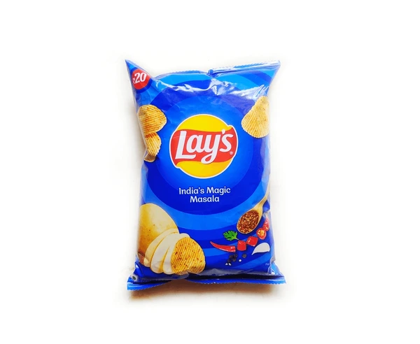
We played with flavor-based color themes, aligning backgrounds and props with the iconic Lays packaging — sunny yellow for Classic Salted, spicy red for Masala, cool blue for Magic Masala, and vibrant green for Cream & Onion. This created an instant visual connection between the flavors and the emotions behind them.
Some of the most memorable frames came from real snack moments with friends — unposed laughter, spontaneous reaches into the bag, and those small chaotic moments that only happen when snacks bring people together. These candid expressions gave the shoot a warmth that felt genuine and relatable.
Our close-up texture shots added a layer of intimacy, showcasing every ridge, every sprinkle of seasoning, and every crunchy curve in stunning detail. Meanwhile, the bowl shots overflowing with perfectly stacked chips created a sense of abundance and appetite appeal — the kind of image that makes you want to grab a handful instantly.
Together, these visuals told one powerful story:
Lays is more than a snack — it’s a part of everyday life.
Casual. Fun. Spontaneous. Joyful.
Exactly the way snacking should feel.
What Made This Project Special?
This shoot allowed me to blend the best of every part of my craft:
• Technical styling that ensured every chip looked crisp, golden, and camera-ready
• Playful creativity that brought movement, color, and excitement into every frame
• Real, everyday emotion that made the visuals feel human, joyful, and instantly relatable
Lays isn’t just about chips — it’s about memories, friendships, and moments of pure fun. Styling for them felt like capturing tiny slices of youthful joy, the kind of moments everyone has lived: game nights filled with laughter, study breaks with shared snacks, unexpected giggles during movie marathons, and those little bursts of happiness that happen when someone opens a fresh packet.
And the best part?
The client loved how the final images turned out — vibrant yet relatable, crisp yet natural, energetic without being chaotic. The visuals felt true to the brand while still having a creative spark that made them stand out.
For me, this project was the perfect blend of commercial styling and creative freedom — structured enough to have purpose, but playful enough to let imagination flow. It reminded me exactly why I love doing what I do: creating visuals that don’t just look good, but make people feel something.
Final Thoughts
The Lays India project was a reminder of how exciting snack styling can be — fast, lively, colorful, and full of personality.
Every chip, every frame, every splash of color came together to create visuals that make you want to grab a pack right now.
To explore more of my styling journeys, visit:
👉 www.jyotifoodstylish.com